US Unemployment during Covid-19: Data Visualization
May 31, 2020
Introduction
Covid 19 has affected all of our lives in many ways, the job landscape is reported to have changed drastically in the US. Many of the friends I talked to were of the opinion that while many sectors experienced hiring freeze or layoffs, some sectors have also seen an uptick in employment opportunities as we continue to adjust our lives to this new normal. So I decided to scrape some data from reports published on the website of Bureau of Labor Statistics this May, and do some visualizations to educate myself.
Below are the take aways -
US Workforce: Trends and Distribution
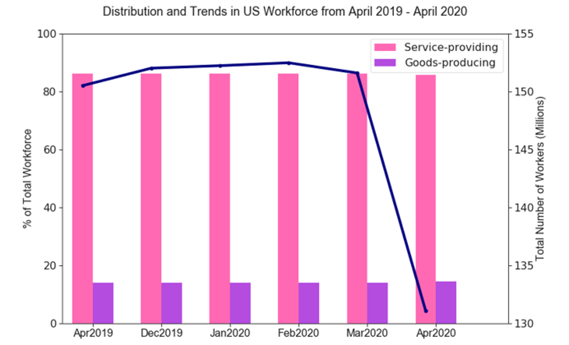
The total non-farm (i.e. all employees except farm workers, private household employees, or non-profit organization employees) employees in the US can be grouped into to two major categories or super-sectors - Goods-producing industries and Service-providing industries. The barplot below (Figure 1) shows the distribution the US workforce in these two super-sectors over the years while the line plot represents the total employment over the year. As of April 2019, around 86% of the US workforce are employed in the service providing industries whereas the remaining 14% are employed in the goods-producing industries. The chart shows that while roughly 20.53 million lost their jobs only during the pandemic (i.e., March 2020 - April 2020), their distribution in these two super sectors remained steady over the year and during this pandemic.
Snapshot: Goods-producing vs Service-providing Industries
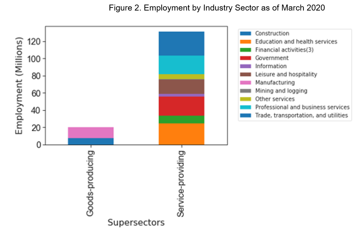
The goods-producing industries largely comprises of manufacturing and construction and contributed to employ roughly ~20 million Americans as of March, 2020 (Figure 2). The major industries in the service providing sector are education and health services, government institutions, trade and transporation as well as professional and business services. Each of these four subgroups in the service-providing sector alone provided more jobs (>20 million) for Americans than the goods-producing sector.
Unemployment During Covid-19: Ranked by Industry
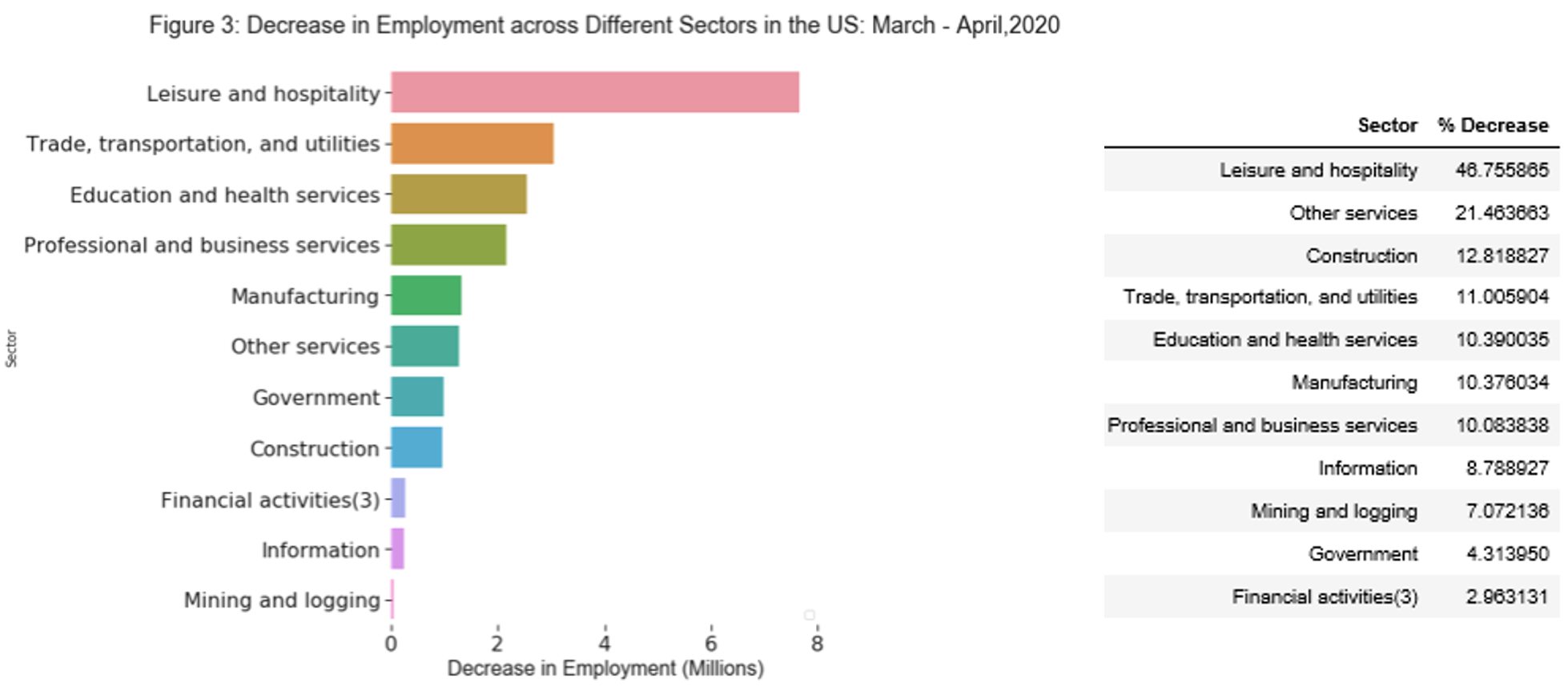
Figure 3 charts the number of layoffs (i.e. increase in unemployment) in ranked order from top to bottom. All the industries across the US were negatively impacted due to the pandemic. The Leisure and Hospitality Industry was hit the hardest. Roughly 46.7% (~7.6 million) of the Americans working in this sector lost their jobs between March - April 2020 due to the pandemic. The top 3 sectors in the chart taking the worst hit of the pandemic represented 45.4% of the US workforce in March 2020.
To help further evaluate the impact on different industries, percentage reduction of workforce in all major industry sectors are ranked and listed in the table next to Figure 3. Based on the total number of employments in March 2020 and lay offs over the month, Americans working in Financial Services (represents 5.6% of total US workforce) and government institutions (represents 15% of the US workforce) were relatively safer when comes to remaining employed. Both sectors experienced less than 5% decrease in their respective workforce
The number of job cuts in the Education and Health Services came as a surprise given the increasing need of support required at the hospitals at the moment. My initial impression was that the uptick of hiring in the hospitals was offset by layoffs in other non-emergency services in the health or education sector. But visualization of the employment data at the next sublevel shows that it is probably not true (Figure 4). Healthcare is one of the top three sectors going through a decline and educational service also followed the downward trend in the employment during March - April.
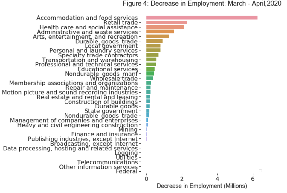
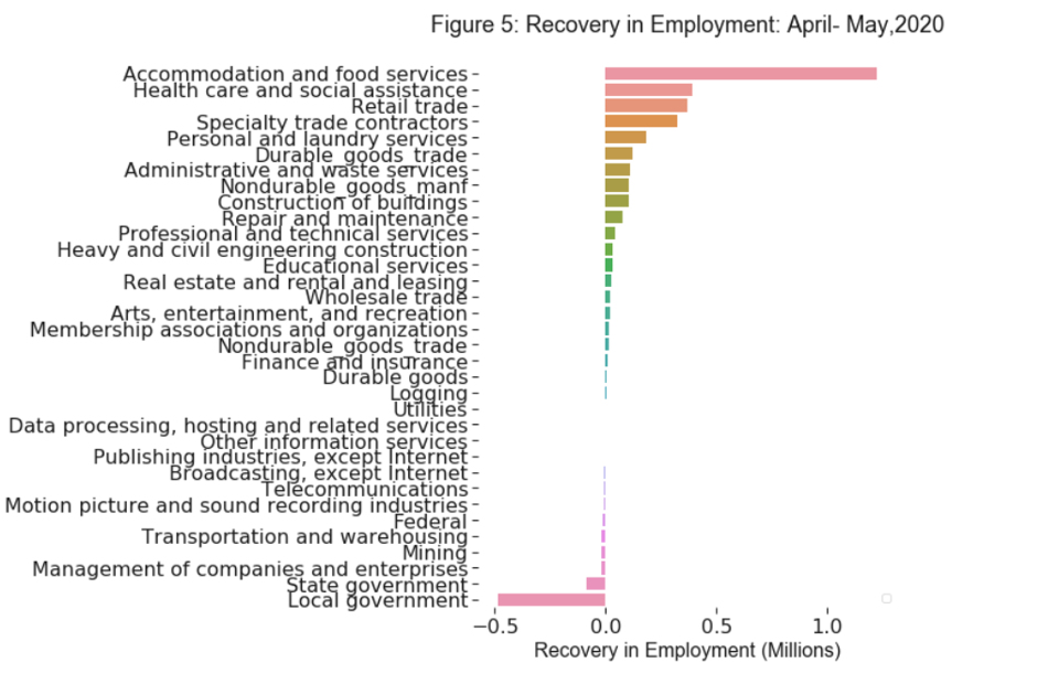
Figure 5 below shows some recovery in employment by different sectors during April - May,2020. I added this plot an extension after Bureau of Labor Statistics relased a new employment report on June 5. The results shows some recovery in employment in most of the sectors while employment in goverment sector (local,state and federal) and some other areas such as entertainment industries and transportation continue to decline. This partial recovery probably reflects the shift in demands as people adjusts their lives afer the initial fear of the pandemic during April and many places in the states/industries begin to loosen their lockdown policies.
Unemployment during Covid-19: Ranked by State
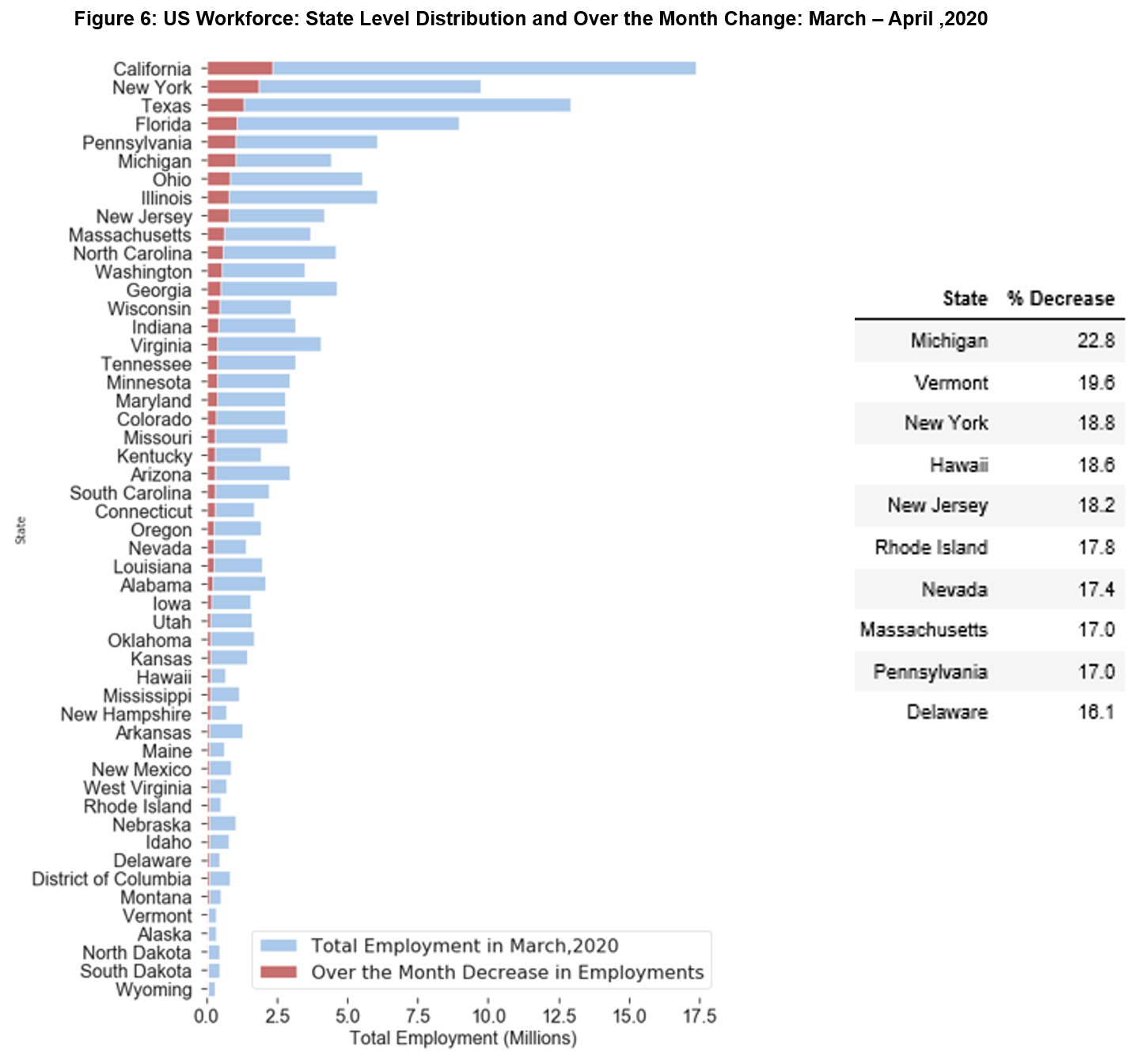
The number of employment decreased in all the 50 states and the District of Columbia during March - April, 2020. The largest job declines occurred in California (2.34 million), New York (1.83 million), and Texas (1.3 million) (Figure 6). These 3 states were also the top 3 places providing ~36 million jobs altogether to the Americans as of March, 2020.
The largest percentage declines occurred in Michigan (-22.8 %), Vermont (-19.6 %), and New York (-18.8 %) (Table next to Figure 6). The effect of the pandemic on US employment is probably more severe in the east coast than the other regions. As highlighted in the table below, 7 of the top 10 states (Vermont, New York, New Jersey, Rhode Island, Massachussets, Pennsylvania and Delaware) that were hit hardest are from this region.
Conclusion
To summarize, roughly 20 million americans lost their jobs between March 2020 - April 2020, and unemployment in the US has increased during this period for all industrial sectors and in all the states. While all of our lives have been impacted to some level, people working in the leisure and hospitality industry or living in the east coast are probably experiencing a more challenging time in terms of job security than the rest of us. However, recent data published by Bureau of Labor Statistics on June 5 shows that employment has increased by 2.5 million in the US between April - May, and this upward trend is seen mostly in different private sectors. While the overall number of jobs is still way below the number before the pandemic, it would be interesting to see based on the data in the upcoming months if we are actually on a path to recovery.